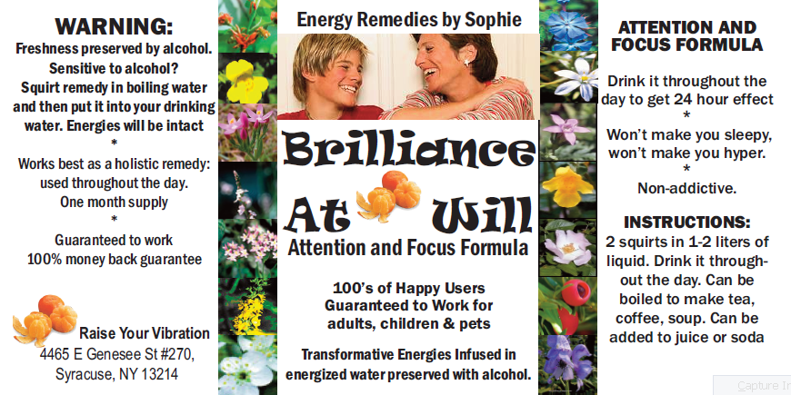
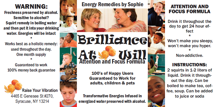
Hi! The contest hasn’t ended, but I have created a product based on the feedback so far… with two different labels. Here they are, #1 and #2. The only difference is in the little pictures: version 1 has the Bach Flowers, version 2 has ADD children… before and after the remedy.
Which one do you think is better? Please comment to vote.

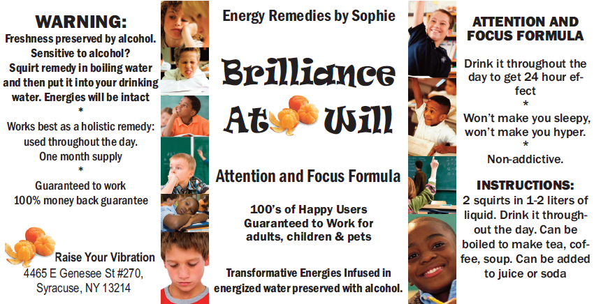
And the version suggested by John, the artist


All three look good. The version with the mother and son with the flowers works for me. Good energy, and the flowers become a pattern.
Regarding the third label option you added: Removing the central picture does make the label less busy and more pleasing to the eye. BUT you lose the benefit of having the smiling son and mom on the label. To me, that picture increases the appeal of the product and helps sell more bottles.
I vote for the label with the children, before & after – label 2
The version with the children. The flowers, while nice looking, don’t demonstrate a result.
I vote for the children version. It looks more relevant to the central picture and I see the fact that it seems more active as a good thing – it’s supposed to keep you running smooth, right?
Kids.
Flowers are great on the HOE. The label might also work without the large central photo.
Love the name.
My vote goes to the label with flowers. I agree with Amy, and also it reminds HOE which is already known to many for its benefits
With the pictures switched it looks great! Definitely gets my vote.
ok Kathryn, I swapped the two sides and put that version in the post
If you use the label with the ADD children, I recommend you switch the “before” pictures to the left side of the label and the “after” pictures to the right. That’s the order in which before and after are usually shown in the United States, so the way the label is right now looks to us like the children are getting worse instead of better.
One other possible pitfall with using the ADD children is that if someone glances at the label and only sees the “before” pictures, they may think the pictures are of people who have taken the remedy and get a bad impression. That may sound crazy, but keep in mind that the vibration levels of most people are low and they don’t see the whole picture, so it could happen.
That said, my vote is for the label with the ADD children. The contrast of the before and after pictures is dramatic and gives a great impression of the product.
I vote for version 1 – the flowers. It looks more calming. Version #2 describes the name of a product better but it looks too busy for me.
My vote is for the version with the kids on it.